Blog articles in August 2018
28th August 2018
Don’t adjust your glasses. Don’t run to your doctor for a new prescription. It’s not your eyes, these designs from the Brintons archive are just blurry.
We dove into the design library and delighted in the many patterns that had blurriness as a common thread and found, that while “blurry” could be used as a surface level description, the moods that blurriness can conjure in an environment are plentiful.
Blurry can be tranquil and soft, evocative of a foggy morning or a dream-like state.
More literally, a blurry design can distort the barriers between two distinct spaces, creating a setting where people move freely and experience the facets of an area more fully.
Our favorite discovery, perhaps, were the blurry patterns that expressed movement and dynamism. Think of the flash of a taxi rushing by you, or the thrill of a photo-finish. Or even Giacomo Balla’s Dog on a Leash, where his goal was to capture many moments of movement in one frame.
We’ve compiled the highlights of Brintons blurry designs and encourage you to take a look. Browse as slowly as you’d like; no matter what, it will all still be a blur.
22nd August 2018
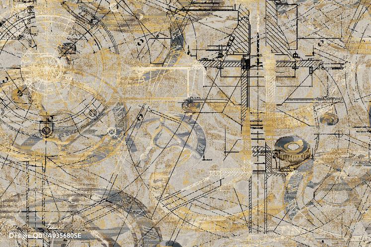
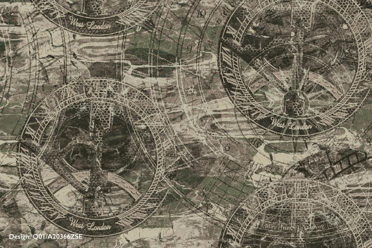
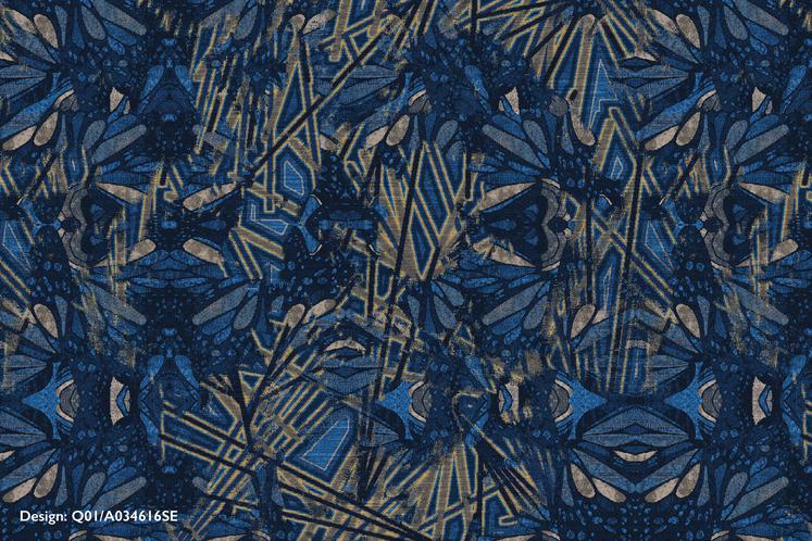
All in due time: As the year long creative venture comes to a close, the last group of self-expression project designers respond to a more literal representation of time - the sundial. Designers studied the object for two weeks before diving in and translating their thoughts into axminster carpet.
To see the 12 month evolution of the project and a glimpse behind the conceptual scenes, check out Interiors + Sources' article Encouraging Expression here.


"My challenge for this project was to make the sundial into an abstract version of itself. By concentrating on the light striking the shiny gold arcs of the sundial, I was able to abstract the Da Vinci inspired mechanical drawings enough to achieve my final axminster design"
Donna Davis, Senior Designer, Brintons Americas
Design: Q01/A035680SE

"Natural light, changes in the weather, and even the texture of concrete it laid on guided my color and texture decisions. Studying the angles of the shadows cast throughout the day, I took the literal shapes and twisted them around using different opacities to create layers."
Cherise Porretto, Senior Designer, Brintons Americas
Design: Q01/A22370ZSE

"When given the sundial to respond to, I immediately envisioned a casino design with a large and detailed repeat. I wanted to create something that would draw in people’s attention and pique their curiosity."
Solongo Drini, Senior Designer, Brintons Americas
Design: Q01/A20366ZSE

I was inspired by the sundial’s representation of time. This lead me to think of butterflies and the chaos phenomena 'The Butterfly Theory'. The butterfly wings in my design symbolize alternate theories overlapping each other and the linear angles represent the gnomon of a sundial as they both intersect randomly."
Nandita Gharat-Hurt, Senior Designer, Brintons Americas
Design: Q01/A034616SE
We use this blog to share information about our work for the benefit of
customers. You can use our archive below to browse previous articles.
Recent blog articles


